Showing posts with label digital painting. Show all posts

Saturday, 26 February 2022

Tabulae Mortuae V (Archives XV): Digital paintings die too...

 Every now and again I show an image from the Creature Vaults, those hidden domains where old sketches, failed paintings and discarded designs find their final resting place. 'Final', unless they are dragged out to be presented to the world, usually for the first time.

Click to enlarge; copyright Gert van Dijk

This image is one such, and it is the first to come from a vault without physical form. Other vaults consist of large cardboard folders, or of stacks of oil paintings carelessly stacked against the back wall of a closet. This vault is digital.

I started the conversion of the Furaha project from oil paintings to digital art some 11 years ago. The project, now nearly done, changes as time passes. The Great Hexapod Revolution had as a result that legs, heads and jaws or earlier hexapods no longer followed my self-imposed rules. The changes were too large to be solved with moderate cosmetic changes (I tried), so many paintings are now seeing a 'Mark II". In fact, some started as oil paintings (MkI), were later redone as digital paintings (MkII), and are now revisited to become MkIII. Mind you, most paintings these days are entirely new.

Click to enlarge; copyright Gert van Dijk

Here is some more detail of the head of this now defunct animal. It is a pity that I had to discard it, as I rather like the painting. But I kept the overall design and colour scheme for the MkIII version, which is nearly finished, and looks just as well or better, I think.

The animal is a 'thresher', with the Latin name 'Ira tarda'. That means 'slow anger', a name that was inspired by memories of an old teacher of mine. Threshers are solitary, grumpy and are best left to their own devices. They do have to meet from time to time, in view of the perpetuation of the species, but their behaviour at such times gives little indication of a mood upswing. Best not talk about it, really.


Wednesday, 13 November 2019

Work in progress: the prigoon again


Lately, I have been wondering whether it is really a good idea to keep the paintings hidden until the publication of the eventual book. If I do not show the paintings, then I should probably keep interest going by writing posts more often. But the kind of posts I write, with literature searches and illustrations made to order, take a lot of time.

Perhaps I should write some shorter posts instead, just short ones, without much depth. Let me known what you think of such an approach.

Click to enlarge; copyright Gert van Dijk
 To try it out, here is a work in progress: I have worked on the prigoon's head and back shield. I like painting textures, and thought I should try my hand at iridescence.  The legs need to be detailed, but that is fairly boring work. After that I wil work on the shdows some more, because the animal is a bit flat right now. At the very end I will probably use blurring to create the idea of macro photography.

Monday, 3 October 2016

Painting 'Arrival at Furaha' II: how thick is the terminator?

No, this is not about the waistline of an ageing time-travelling cyborg.

A 'terminator' is also the boundary line dividing the dark and sunlit areas of a planetary surface. The Apollo missions made it very obvious that the terminator, in the case of Earth, is not a thin sharp line but rather a blurred zone in which light fades from full sunlight to total darkness. In the case of the moon it is much sharper, suggesting that our atmosphere has a lot to do with blurring the terminator. Once I had asked myself how wide it should be, I felt it difficult to simply guess its width. I thought it would be easy to find on the internet, but to my surprise it was not. So I did some simple mathematics.
Click to enlarge; copyright Gert van Dijk


In the scheme above the circle at the left is a planet, and the one on the right is the sun. On a point on the day side of the planet a viewer can see the entire disc of the sun. But when the sun sets, part of the sun's disc drops beneath the horizon; in other words, some of the rays of light from the sun cannot reach the surface. So which is the area on the planet where only part of the sun's disc is visible? That area is the terminator.

Point A above is where a tangent line from the 'top' side of the sun just touches Earth, and point B is a similar point where a tangent line from the underside of the sun touches Earth. The zone from A to B is the terminator, and it is not difficult to express that in angles. But that is all without an atmosphere. I reasoned that the same tangent could travel on through the atmosphere, where it could scatter in the atmosphere, casting some light on the surface. So I also calculated point X as the furthest point where light might be scattered.

The trick then was to put in the proper values, in units of one thousand km. The radius of Earth becomes 6.371, that of the sun 693.7, the distance between the sun and Earth is 149600, and the thickness of the atmosphere is 0.1. Mind you, that latter value, 100 km, is the 'official' border of the atmosphere, but a more relevant value would be the height where light is scattered; I have no idea.

Click to enlarge; copyright Gert van Dijk
So here is a close up of Earth with the proper values put in. The thing to remember is how large space is: the distance between sun and Earth makes all the triangles extremely narrow. The angles of point A and B are 179.7 and 180.2 degrees (the angle starts counting at the top of the planet, so 180 degrees is pointing straight down). That is only 0.53 degrees! I thought the effects of the width of the sun's disc would be larger, but mathematics doesn't lie. The angle for point X is 190.3 degrees, so the angle from A to X is 10.6 degrees. That is closer to what space photographs suggest. But how correct is it?

Click to enlarge; copyright NASA

Above is an image from NASA, rotated. I put some orange dots on it, over Gabon, that to my mind define the width of the terminator. I compared that to a map of Africa, and estimate the width to be five degrees. So apparently I overestimated the height where light gets scattered. The lesson is clear: the width of the terminator depends almost entirely on the thickness of the atmosphere. Good; I can now plug in the values for Furaha and paint the terminator at the correct width. Well, a useful estimate, anyway.       

Next time I will show some timelapse video's of the painting as it progresses (as soon as I manage to upload them, that is).

Saturday, 24 September 2016

Painting 'Arrival at Furaha' I

I will try something new: I will document how I produce a painting, meant for The Book, as it develops. I always said I would not show new paintings, as that would probably ruin the chances of ever getting the book published. I decided to make an exception: the painting I have in mind is not a major one showing an animal or plant, but a minor one showing the human side of affairs. As you will see, digital painting uses a variety of digital techniques to help find a good composition, get the perspective correct, etc. I am not alone in this: If you read books on digital painting techniques, you will find that professional illustrators do this all the time. 

I needed a minor painting for the two-page spread introducing the chapter on the Nu Phoenicis solar system and the planetology of Furaha. These chapter introductions show a minor painting and a quote, usually from Souren Nyoroge, whose book 'Furaha and Earth: similar in their differences' elevated him from one from one of The First, to Furaha's foremost historical hero (I may slip from real life comments on the painting to 'in universe' remarks, so pay attention).

The quote was about Nyoroge, the scientist, and Bruyningh, the agitator, looking at the planet after arriving there and realising that from that point on it was not just a planet, but their World. That point in time seemed a good theme for a painting and I already had a scene in mind, with the two of them looking at the planet from their spaceship, silhouetted against the blue sphere of the planet. Over 20 years ago I photographed friends of mine in the Vancouver aquarium, silhouetted against the blue waiter of a large tank with beluga whales, with vertical window frames separating the worlds on either side of the glass. I would like to show that photograph here, but have no idea where it is. No matter: a Google search for 'Vancouver aquarium silhouette' will show you that many people took very similar photographs. However, there are no vertical window frames in the Vancouver aquarium, so I must have added the notion that there were any there to my memories at some time. Memory is  malleable.anyway, the mental image, with frames, looked better than the true view without frames, so I  went with frames. The design is simple: two silhouetted people, window frames, and a planet.

Click to enlarge; copyright Gert van Dijk
I have always illustrated the sizes of Furahan animals by adding the silhouette of a human, and these humans do not just stand there, but usually do something (I have seen others take up the habit of having 'scale-humans' do something, which I like). I either draw these silhouettes by hand or base them on a photograph of someone posing, which is them modified as much as it needs to be. Above are two such recent silhouettes. One was hand-drawn from the start and the other is based on a photograph; guess which is which...

For the 'arrival' painting I could have chosen the same route, but quite by chance I came across the free program 'MakeHuman' that looked like it could be useful. It starts with a generic 3D human of which the age, gender, height, weight etc. can be adapted easily. I made a slender character (Bruyningh) and a stockier one (Nyoroge). So far so good. But then I found that you cannot change postures in the program itself, but have to use Blender instead. Unfortunately, I cannot work with Blender; I find its interface incomprehensible (it is free so is certainly worth having a look). That's the end of MakeHuman for me, then. Luckily there were some example postures included, so I used those to export the two characters. These were not what I wanted, but I could easily redraw their anatomy and pose later; the 3D objects only serve as scaffolding for the drawing anyway.

Click to enlarge
The next job was to import these persons into Vue Infinite and to construct a spaceship. Luckily, all I needed of that spaceship was a floor and window frames. I wanted very large windows to give a luxurious feeling and allow the planet to be shown as a large object. I used 'cubes' to built the frames, imported the characters, hung up a big blue sphere and added some lighting. After that, I moved the 'camera' around to play with the composition. Above you see a view of the Vue programme showing the characters on their tiny section of spaceship.

Click to enlarge; copyright Gert van Dijk
And here are a few images of the results of this early stage. I decided to go along with something like the third one. At this point, I haven't started to paint yet, and I will keep that for the next instalment. But there are quite a few things to think about:

  • I have to change the blue sphere into a proper Furaha model (I already have one). I will have to work out where the 'terminator', the line dividing night and day on a planet, should run. It has to look attractive but also has to be correct. This also includes working out how wide the blurred part of the terminator should look. The mathematics of calculating that should be easy, but I will check astronomical sources anyway.
  • The window frames look fairly boring; perhaps I should change their shape
  • The humans should get clothing; what does one wear during protracted space travel? Is it hot on a spaceship?
There are other implications: the image tells a lot about the Furaha universe. If people stand on a floor in a spaceship, they either have shoes that stick to the floor, or they have artificial gravity. I'll go with the last choice. So do almost all science fiction movies, so I doubt many people will even notice. 
  I already had a concept in mind of how people get around on Furaha: they use large lumbering vehicles that float in the air much in the same way that bricks don't (yes, Douglas Adams said that). They use a gravity-repulsing mechanism as a reverse zeppelin. A true zeppelin uses a great volume with very little mass to lift a few kg of mass; well, the repulsor zeppelin also lifts just a few kg, but using a great mass. Don't ask for blueprints. Not yet, anyway. This 'Leyden Mass Repulsor Net' (TM) works for spaceships too. Quite well, in fact, as its efficacy increases more than linearly with its own mass (I just made that up). Basically, you wrap the Repulsor Net (TM) around some mass, such as rocks, lots of water or a concrete-filled submarine, apply energy to the net and there you are.
  So all this explains why there is artificial gravity on the spaceship, why spaceship designers do not care about saving weight (the opposite, in fact), and in turn it explains why they can have large windows.

Tuesday, 24 May 2016

Painting a Cthulhuoid carapax (Digitally painting Furahan lifeforms II)

As blog titles go, this one is not likely to win the prize for 'succinct clarity'. Actually it could, provided readers already knew what a Cthulhuoid was, what its carapax was, and why you would want to paint said carapax. To make matters worse, there formally never was a 'Digitally painting Furahan lifeforms I'. But one earlier post would in retrospect deserve that title.

What does the title mean? Well, the word 'Cthulhoid' describes a clade of marine Furahan animals that do not seem to be able to make up their minds whether they should be pelagic of benthic ('pelagic' refers to the 'just water' part of a sea or lake, not close to the bottom nor to a shore, while 'benthic' refers to the bottom of a sea or lake). Some Cthulhuoids use the tentacles close to their face -hence the name- to move around on the bottom or even create their own hiding places, while others use their fins to propel themselves through the sea. A 'carapax' (a term I prefer over 'carapace') is an animal's armour, say its shell. The cthulhuoid carapax covers the head and usually part of the back. Finally, why would you want to paint one? You, the reader, might in fact not want to do this at all, but I wanted to, to create an image for The Book.

I am not going to spoil The Book by showing major paintings here or anywhere else, but I can make an exception for part of a minor illustration. The illustration in question shows a few examples of the riotous array of colours and structures of cthulhuoid carapaces. The problem with 'riotous' colours, in stripes and spots, is that every spot must be painted in the correct shade for where it is on the object, and that includes different shades within each stripe or spot. With oil paints this proved to be a painstaking job, requiring small pointy brushes, a very steady hand and lots of patience. Digital painting has made painting such complicated objects much easier, as I will illustrate here. I will assume some familiarity with 'layers' (in digital painting, a layer is like a sheet of glass: what you paint on it covers things on underlying layers, but parts unpainted on a layer let you see underlying layers. You can paint on a layer under another layer. I use Corel Painter because it can mimic real brushes quite well.


Click to enlarge; copyright Gert van Dijk

Let's start with a suitable carapax shape. I modelled one in Vue Infinite and made a simple render in which the 3D shape is overlaid with simple lines that define contours of the shape. These help get the perspective right, in a fraction of the time that a conventional perspective construction would require.  On a separate layer I drew lines with a 'brown pencil' to outline some interesting spots, aided by the lines that help keep the 3D shape in mind, and also help ensure symmetry.


Click to enlarge; copyright Gert van Dijk


The next stage uses a layer under the brown pencil one. This new layer contains the basic colour of the beast, which in this case means dark blue sides with a lighter colour down the middle. Note that I made absolutely no effort to represent shading here: the colours are supposed to be completely flat.

 
Click to enlarge; copyright Gert van Dijk
I then added another layer, again just under the pencil layer. On that one I painted the spots an even deep yellow colour, to contrast with the blue underpainting. Again, this is completely flat. Note that the result contain three layers: the pencil lines, the yellow spots and the blue basic colour.  We will leave these layers for now and hide them from view.


Click to enlarge; copyright Gert van Dijk

Using the same Vue render as before I then painted the carapax again, but this time without colour, using just shades of grey to convey a sense of depth as well as a surface texture with same plates on it. I rather like the way the shininess turned out: the surface is shiny, but more like a pearl than like chrome. The shininess should allow the colours to remain well visible.


Click to enlarge; copyright Gert van Dijk
The trick now is to combine the flat colours with the grey layer defining the shape. There are at least two ways to do this. In the one shown above, the grey 3D layer changes the aspect of the solid colours below. There are many ways in Corel Painter or in Photoshop of making one layer affect an underlying one. It is often hard to predict what they do as their names often make limited sense. The result shown above was obtained by applying the grey '3D' layer to the underlying flat colours as 'hard light'. Not bad, is it? You may note that part of the 3D structure indicated by the grey layer is obscured by the strong colours. That is very often the case with strongly contrasting patterns.


Click to enlarge; copyright Gert van Dijk

This particular image is based on the opposite approach: the grey 3D layer was used as the underlying basis and the colour layers were moved on top of it, where they affected the grey layer through an option labelled 'colorize'. As you can see the result is not the same, which is part of the fun of digital painting: there are new options to discover daily. Of course, it may be better to stop discovering them and get to work at some point, or you will never get any work done.


Click to enlarge; copyright Gert van Dijk
Finally, I went back to the earlier version and decided to change the colours on the flat colour layers, which only takes an instant. The blue basic colour became solid yellow, and the yellow spots turned black. The grey layer is again used to provide a 3D aspect to the carapax, but this time I turned down the 'hard light' effect so the highlights are less conspicuous. I then added two shiny spots with fairly sharp edges to get a surface effect like porcelain. On yet another layer I painted flat white regions at the edges of the carapax. These were then made almost entirely transparent to represent reflections of lighter objects in the vicinity. I present this version here to show that separating colour and structure allows for some quick experiments. It is not the way I paint most often though: usually I paint shadows directly, using appropriate colours.

To paint other shells I did not use this method, as I thought that using the same outline every time would make the result boring. Instead, I designed and painted a new shell from scratch each time.  

And there you are; a painted cthulhuoid carapax. The illustration should end up as probably about two by two cm, so it will be small. This particular carapax belongs to the species Myrmillo testudiformis, or in common speech the 'turtleback snigel'. Such shells are collector's items, by the way.

Saturday, 7 March 2015

Blog halts after nearly seven years...

I thought I might as well convey my main message in the title, so there you are: The blog 'Furahan Biology and Allied Matters' will not see new posts with regular intervals.

There will be the occasional post now and then, but those will be limited to announcements of something interesting, such as me giving a talk somewhere, a conference with speculative biology in it (perhaps Toulouse later this year). I will definitely provide a review of my French friends' work as soon as I have the book in my possession, which will be four to six weeks from now. But there will no more posts on biomechanics and no discussion of exobiology in films or the work of other artists.

The reason is not that the well has dried up. There are many interesting artists who display their work on the internet, and I could write about the consequences of more effective photosynthesis, or why Furahan trees have a 'clastocyte' layer of cells that breaks down wood. Of course, my 'long thought experiment' on the purpose of toes would deserve a post, and a comparison of Boston Dynamic's Big Dog and the apparent new Chinese equivalent provide an interesting comparison on whether legs of alien animals should have zigzagzig or zagzigzag patterns. But no...

The reason is time. My job requires 50% of my waking time, so there are not many hours left. A simple blog post such as this one takes over two hours to produce and put up. However, the really complex ones, the ones that required me to read books, study papers and provide additional illustrations, could run up to more than eight hours. The blog competed with painting and writing, so progress on The Book was slow. The Book is about one third finished, and a two-page spread usually shows one main painting, and additional illustration, a size sketch and text. Of all these things, writing is by far the fastest element. A two-page spread probably takes 20 hours, and The Book is supposed to have up to 140 pages. It dawned on me that giving up blogging would allow me to increase my painting output considerably.

There is another element involved. Painting is –obviously- an acquired skill, and you have to keep doing it simply to avoid losing your skill, and to become better requires even more work. I have blogged in the past about crossing over to digital painting. Its main advantage is the enormous increase in speed of production that also translates to an increase in learning speed. But you still have to keep doing it. For years I found it difficult to start up again after a hiatus, and because of that I needed to be relaxed to do it well; hence the low output. I reasoned that, if I painted something every week, my skill level might not deteriorate so I could put in an hour here and an hour there. That seems to be working, and I now plan to produce at least one spread a month. When will The Book be out? An optimistic count would be three few years, an a pessimistic one never (in which case I will dump all the material on the internet) I guess. There is a chance that it may appear in French... Any news on that will certainly merit a post.

So there you are. I would like to finish by thanking all the readers who showed enthusiasm for my work over the years. Their comments often made me think again, or more, about any subject. And once in a while those comments produced a new Furahan animal. The Book will have six pages on rusps (already finished).  I will show one species to be shown on one such page, born from a discussion of high-feeding rusps. That particular discussion mostly featured Jan and Petr, but they are not the only ones providing inspiration. Thank you all! 

Click to enlarge; copyright Gert van Dijk
The grey outline shows the brontorusp for size. The new species, provisionally named 'Giraffacrambis sp.', is much narrower and less massive than the brontorusp. It still is a formidable animal, though. 

Tuesday, 24 December 2013

Influence of the rostrum linkage system on forage volume in Brontorusps (Brontocrambis brucus)


A Christmas Special!
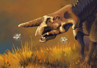
Ahead of the normal schedule, and with dinosaurs, rusps and biomechanics!

Click to enlarge; copyright Gert van Dijk
The title of this post sounds like that of a proper scientific paper, doesn't it? Something out of the 'Journal of Astrobiological Biomechanics', I guess. It's time to look at rusps again. My big rusp painting is finished, and as it is meant as a double-page spread, it is large: 7200 by 2700 pixels. A spoiler is shown above showing a fragment of a rusp in the background of the painting. The fragment has been halved in size and its area represents just 2% of that of the entire painting. The painting is based on earlier sketches. For more on rusps, either visit the main Furaha site or look at these posts: sketches, anatomy, predation, concept paintings, etc.  

The evolution of new Furahan animals gets more complicated with time. In the beginning I just sketched a pleasing shape and started painting right away. Now, I worry more whether the animal makes evolutionary, mechanical and ecological sense. Well, up to a point; this is science fiction and supposed to be fun, after all. 

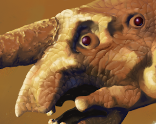
Here are some of the steps in rusp 'ontology': they started with some quick sketches, and then the slow evolution began: successive legs were offset medially and laterally to avoid legs bumping into one another, followed by an arrangement for their skeleton. Their fore and aft whips are long and held horizontally rather like the tails and necks of sauropods, and hence have a similar system of internal trusses as compressive elements at the bottom and ligaments at the top to withstand tensile stress. The whip is held up passively by these forces, so avoiding the high cost of doing that with muscle force only. The last stage involved refining the head of the rusp, and in particular its snout, or 'rostrum'. In an earlier post this rusp species was called Mammoth Rusp / Megacrambis, but now it is the Brontorusp / Brontocrambis; yes, that means 'Thunder Caterpillar'!  The Mammoth Rusp still had some intricate limbs functioning as additional feeding aids under its snout. I was not too certain of that arrangement, and my doubts were confirmed by comments on that post. So the Brontorusp no longer has these additional mouth parts. The thing is, now we have a massive animal with a large head. How does it feed itself?

The mouth of the rusp is in its head, which seems obvious but in speculative biology not many things are obvious. Also note that rusps are large herbivores: they need a lot of food and spend much of their time eating. Moving about is costly, so it would be best if they moved the least possible amount to get their food, which does not sound as if there is much room to save energy. Let's tackle that by considering the problem of getting an animal's mouth on vegetation; there appear to be four solutions to do so; rusps use the fourth, but we'll come to that. The first solution, always necessary as vegetation will not come to you, involves walking to the food source.

Click to enlarge; copyright Klein et al; Biology of the sauropod dinosaurs. Indiana University Press 2011
But once an animal arrives at its 'foraging station' a nice way to save energy is to keep most of the body motionless and to have a long neck allowing the head and mouth to move about independently of the gut. For very large animals, needing to feed all day, it pays to divide their anatomy in mouth and guts; the rest is just 'other bits'. Sauropod dinosaurs used that method, and the image above is from a study on how far sauropod mouths could reach, depending on neck length and leg length. The idea is that the neck can move in a horizontal plane 90 degrees to the right and the left, and in a vertical plane straight up and down. If the animal is lying on the ground the volume of space that it can reach is one quarter of a sphere. If the base of the neck is higher up, when the animal is standing, the volume increases. The authors assume that the bottom part of the volume then is cylindrical whereas I would assume that to be spherical as well, but never mind.

Click to enlarge; copyright Gert van Dijk
Swans and geese have very flexible necks and can probably reach every point within that envelope, but if an animal has a neck less flexible than a swan's, only part of the volume is accessible to the mouth. If this is the first time you realised that geese and sauropods might have long necks for a similar reason, good!

The image above shows an adapted 'forage volume' for a sauropod: the outer red sphere is the outer limit of where it can reach, and the inner blue sphere represents the inner limit, assuming that the neck is too stiff for the animal to reach a point closer to its body. The human ('Marlene') is just there to keep the sauropod in its proper place. 

The third solution to get the mouth near food is to use an appendage to shovel food towards the mouth. The best example I can think of is the elephant's trunk, which greatly increases the elephant's reach. The erstwhile rusp mouth limbs were short and not at all good as harvester limbs, and I did not wish to elongate them tenfold; they are gone. I also did not wish to turn the whip into a grasping organ. Rusp whips are not built for that, although in a pickle they can probably be used to knock a branch off a tree. Instead, rusps use a fourth system which is really just a combination of the last two: they carry their mouths towards the food without moving the rest of the head. The 'mouth extender' is extensible and based on a mechanical linkage system. In itself this is certainly not a new idea: Earth fish have such systems in abundance.

Click to enlarge; copyright Gert van Dijk
This image shows a schematic view of the rusp rostrum. Start with the red shape in the foreground: it consists of two V-shapes starting from a vertical axis. All places where elements meet are in fact joints. The pink axis shows that the whole ensemble can rotate, but it can do other things as well: if the two Vs rotate towards one another, the whole shape will become longer and narrower. At its right end, the shape ends in two points on a horizontal line. Now copy the shape, rotate it by 90 degrees, and you get the blue shape in the foreground. The two points where the red shape ends act as connection points for the blue shape. Once connected, some movements from the red shape are connected to the blue one, but not all, and that makes the rusp rostrum quite versatile. In the back you see how the rostrum is formed by stringing red and blue shapes together. In reality the trusses are not formed by straight bones, but by curved ones, so the section of the rostrum is circular rather than rhombic. The cylinder on the right attempts to show the outlines of the bones on a cylinder.


Click to enlarge; copyright Gert van Dijk
And this image shows an as yet unmentioned aspect of movement: if the two starting points are brought closer together, this changes the section of the rostrum as well as its length. The right one is extended, the middle one shortened, and the right one is in neutral position. I expect rusp rostra (yes, that's the plural) to be able to double in length.

Click to enlarge; copyright Gert van Dijk
But we need more flexibility, and that is achieved by rotating the shapes and using the angle between the Vs for additional control. The stylised skeleton in the back shows what can be achieved. So there we are: an extensible and steerable system to get rusp mouths where they would otherwise not reach.


Click to enlarge; copyright Gert van Dijk
Here are two views of an adapted Sculptris model of a rusp head. I take it you will recognise the system of trusses under its hide.

Click to enlarge; copyright Gert van Dijk
And finally, a schematic rusp foraging volume, rather like that of the sauropod (the whip of this model is truncated). Note that the rusp can access a larger portion of the outer foraging volume than the sauropod. The volume itself is smaller though, as rusps are smaller than sauropods, and their rostra extend their reach, bot nearly as much as the sauropod's neck does. Marlene is standing in the forage volume, something I would definitely NOT recommend! In practice, rusps are ground feeders, not bothering about high branches. Have I told you about the ecology of the spotted plains where they live, where post of forests alternate with plains and how rusp feeding habits are to blame for that? No? Oh well, that is another story.  

Saturday, 9 February 2013

Another grouillard: Eructator admonitionis

After an involuntary six month hiatus I have finally been able to pick up painting again, and have since finished one small painting, one big one, have started a new large one, and have generally been working toward producing a pdf file that I can send to publishers as a sample of the book that should persuade them to publish it. I need to do just one additional illustration for the marblebill page, one that will probably show a dawn scene with screeching marblebills outlined against the sky.

I decided to show you one such additional illustration, showing a species of grouillard related to the one on the Furaha site.

Click to enlarge; copyright Gert van Dijk
 And here it is. As you can see, it has a banded colour pattern that just screams 'Here I am!' to any animal with a decent vision. Remember that the grouillard you are familiar with (Oructator olidus) was black and brightly red, so it wasn't exactly given to camouflage either. These warning colours, because that is what they are, tell other animals not to fool around with a grouillard: except for its extremely nauseating and somewhat toxic spit, the animals taste extraordinarily awful. Young predators may bite into a grouillard once, and that grouillard will not live to tell about the experience. But the predator will, and will not bother another grouillard for a long time, if ever.

So there you are. It was fun painting the mossy fungoid thingy on the branch. I still have no good notion of what all the various brushes in Corel Painter 12 can do, my favourite painting software. When I find a better fungoid-producing bbrush, I may erase this one and do it again. So far I set out to copy my usual method of working in oils as closely as possible. That seems to work nicely, so it is time to see what else I can do with this box of tricks.

Saturday, 25 August 2012

A marblebill in progress (also known as the becdacier)

No time this fortnight to write anything elaborate, unfortunately. Some posts take much more time than others. The ones that take most time are those that require checking the physical aspect of some matters, not just because finding sources and digesting the content takes time, but usually also because I then need to do some programming of my own or I have to make some specific illustrations. In short, the heavy science bits take a lot of time. Over the years I have written quite a few words on such subjects, and I started wondering whether I should perhaps bundle them, work them over, write some new chapters, and produce a book on the biomechanics of alien life. Something like 'Darwinian creativity in a Newtonian Universe'. The title is probably much too enigmatic for the book to sell, but perhaps it could be a subtitle. Mind you, it would be completely separate from the Furaha book. But would anyone buy it? Let me hear what you think.

Anyone, I have been working on an update of the marblebill. I showed you another such update once before, and the marblebill is on the Furaha website but featured previously on this blog as well. You may recognise some general update principles. The eyes on stalks are now less prominent, but certainly still occur in various species. There is also eye specialisation. The images below are taken from the sculpting program Sculptris, a free programme I recommend unreservedly.

Click to enlarge; copyright Gert van Dijk

The marblebill is an arboreal brachiating predator, and has two forward facing eyes to help it judge distances and fixate its prey. As is the case for dragonflies, the size of the ommatidia (the individual eyelets in a compound eye) depends on where you are in the eye: they are smaller in the part of the eye facing directly forward. This increases visual resolution at the price of sensitivity to light. The marblebill is a diurnal creature, which makes sense I think: you would need impossibly good vision to allow an animal to hurl itself from branch to branch at high speed at night.

Click to enlarge; copyright Gert van Dijk

There is another pair of eyes, the 'oculi posteriores'. Note that these were not posteriorly placed in ancestral hexapods, whose four eyes were placed around the head. What became the anterior eyes were once the bottom ones, and the posterior ones are the former upper ones. Anyway, in the marblebill lineage the upper ones, alresdy in the posterior position, over time migrated outwards, providing an all around vision, not just in the horizontal but in the vertical plane as well. For an animal living in three dimensions this is more important than for a grazing animal. One result is that it would not be easy to sneak up on a marblebill. Not that there is any other predator up there in the trees that would perform such sneakish acts anyway: it would be too dangerous. The marblebill also does not need much vertical vision for its territorial disputes, as these involve no sneaking whatsoever, but are announced frighteningly loudly. But detecting prey is another matter, and for that these eyes are superb.

Click to enlarge; copyright Gert van Dijk

Here is the painting in progress. I used to work out perspective and draw everything completely without any aid except for the occasional ruler, but I now make use of what the digital age has to offer. So I exported the sculpted head into Vue infinite, made certain the lighting came from the correct direction, adjusted the perspective angle and produced two renders. Cut out the head, place them on a separate layer in Painter 12 (to be deleted later), and everything is in place to start painting. Now all I need is the time to do so...

Saturday, 21 April 2012

Four years on (and back again!)

Four year ago, almost to the day, I started this blog about Furahan Biology and Allied Matters. Over time, the 'allied matters' took precedence over Furahan biology, but the readers did not seem to mind too much. Last February I decided to take a break from blogging for a while. I had found that writing an entry every two weeks was beginning to feel a bit like a load. I think the sabbatical worked, but even I will only know when I start blogging on a regular basis again. I have several interesting subjects in mind, such as animal legs in the recent 'John Carter of Mars' movie or about the colour of plants.

So, what happened to the Furaha project in the last year? Well, I produced several double page spreads. Two dealt with Fishes IV and Fishes V, with five new digital paintings. One spread dealt with a new animal, the 'dandy', a tree dweller with a colourful asymmetric giant claw. I produced three spreads without life forms: two showed the outer and inner planetary systems of Jua (that is the star Nu Phoenicis), and one shows a large atlas-like map. No doubt you would like to see these paintings, but that is not going to happen. After all, all these pages are meant for a 20 to 26 page 'proof of concept' booklet that I can show to publishers, as I wrote last year. The pages look like the sample I showed earlier, right here. My sentiments are that if I cannot sell the idea to a publisher with a worked-out and carefully edited sample like this, I cannot sell it at all. We'll see.

Of course, some pages show older, non-digital work. These do not remain untouched, however. I will show a few images of a work in progress: the prober and bobbuck page. I have no problems with showing it, as you are already familiar with the painting: it is the one at the top of this blog. That image was taken from a photograph; it is remarkably difficult to take decent photographs of paintings: even with digital cameras and tripods the colours are often incorrect, they are not sharp, or not sharp everywhere, etc. To solve that I had all my paintings scanned last year. As some of them are 50x70 cm that required finding a professional scanning service, but it was worth it. I know have digital versions of about 175 dots per cm (120 dots per cm equal 300 dots per inch).

Click to enlarge; copyright Gert van Dijk

Here is an example: this is the head of the prober, taken from the high-resolution scan. Enlarge it to see it at full resolution. The width of this section corresponds to about 65 mm on the real painting, so if you think my painting is rather coarse, take that into consideration. I could of course simply use the scan as such, but I prefer to take advantage of the possibilities that digital painting affords. One reason to do so is that I never considered the biological backgrounds of these creatures when I painted them as thoroughly as I discuss biomechanics in my blog these days. To a large extent the themes developed as I went along, meaning there are some oddities here and there (Well, lots of them, really. For instance, felt that the bobbuck's torso was too short, and that the middle pair of legs would benefit from an idea I developed later: they are further apart than the front and middle pairs. Having painted quite a few Fishes recently, all of which have four eyes, I started wondering why terrestrial hexapods would have lost their lower pair of eyes. Instead, I decide to migrate this pair sideways, giving terrestrial hexapods four eyes. This creates opportunities for visual specialisation as well. I also felt that the eye design need not always involve eyes on stalks, so in may cases the stalks could go.

Click to enlarge; copyright Gert van Dijk

So here is a first step towards the revised painting 'Prober and Bobbuck Mk II'. I selected the animals gave them their own layer, and filled in the background layer roughly. As you see, the bobbuck has already been dissected, and its parts have been rearranged. The eye stalks have gone and the prober has been given a tentative set of new eyes.

Click to enlarge; copyright Gert van Dijk

This is the next stage; the bobbuck's body has been filled in tentatively. Since then I have been thinking about the relative positions of the two animals, but the original one turned out to be best. I will probably alter some more details and smooth some of the brush strokes, but I will have to be careful not to overdo it. Brush strokes have their own charm, and I should be careful not to ruin that by taking the digital element too far. I wonder whether I should revise the prober's beak to include teeth, following a discussion on the bulletin board of the Furaha site of the last few days.

Animals like the prober use their clubs for the heavy work of dismembering a carcass. They have internal teeth and jaws to grind lumps of food, and use their mouths merely to get food inside them. That's why their mouths are like beaks. Still, teeth-analogues are part of their ancestral make-up, and perhaps some tearing and cutting implements would be handy. And so it proceeds...

Saturday, 22 January 2011

It's a 'Fish'!

One of my good intentions for this year was to cut back on blogging. I did have my doubts whether this was really a good idea, as I like writing. Still, blogging keeps me from painting, and I had been postponing that for too long. I had decided to switch from brushes and artists' oils to digital painting about a year ago, but my first attempts proved a shock: I was used to applying paint where I saw the tip of the brush, and now there was a large distance between the graphics tablet and the screen. There were other mishaps as well. Even after changing Photoshop for Painter (more on that here) I still procrastinated, until I put aside enough time to really play with the brushes. Once I managed to forget what I was doing, my visual and motor skills, such as they are, met again and renewed their friendship. To make a long story short, here is my first digital painting I feel I can show the outside world. It's a fish. Sort of.


Click to enlarge; copyright Gert van Dijk

To be more precise, it is a Fusus rostrauctus of the Clade Fishes IV (Proculcapiti). I may have to check naming conventions here though. Anyway, I revealed a glimpse of Fish evolution previously, which I will not repeat. You may observe the typical traits of the Clade, but I will focus on artistic matters here (just as well, as there were some sudden changes in their anatomy compared to the rough sketch in the earlier post!). Having done a fairly large number of full paintings in oils for the eventual Book, I felt I needed additional illustrations, highlighting individual species, cladograms, things like that. This is the first of those. I wished to keep the painting style more or less the same as that of my previous oil paintings, and think I managed. After messing about with Painter's very large assortment of brushes, I settled on just two, and used those throughout (for those in the know, I used a detail oil brush and a blender, but tweaked size, opacity, 'resaturation' and 'bleed' continuously).

Just for fun I will show some layers of the final painting. The nice thing with digital painting is that you can use layers of colour that stay separate, so you can go back to a deep layer even after you painted others over it. In a 'real' painting ('physical' painting?) the only way to correct a deep layer is to scrape it, and everything on top of it, away altogether.


Click to enlarge; copyright Gert van Dijk

So here is the start of my project (it's not a tutorial: I'm not good enough for that). I started with a rough sketch and simply changed lines and shapes until the concept became more or less ready; that is the image on the left. I then drew a much neater line drawing on another layer, and used that as a guide for the painting job: the one on the right. In old times, I would have done exactly the same, but using various sheets of paper for the sketches on the left and one sheet of transparent paper for the one on the right.


Click to enlarge; copyright Gert van Dijk

After that you start painting. In this case I chose flat colours to start with. With oils, this basic colour layer would have obscured the line drawing on the board. Digitally, things are different: you can paint underneath your sketch, so that stays visible. Very odd at first, but extremely useful. The base colours are on the left, but without the line drawing. After that, another layer was added (on the right), and that is where it becomes interesting: that one modifies the base colours with shadows and highlights, as well as with some subtler colour changes here and there.


Click to enlarge; copyright Gert van Dijk

After that I decided to add another colour layer (I should have done that before, but, as I said, I am new at this). The rest comprises adding some reflections, details, some final shadows etc., and there we are. Mind you, the original is almost 7 times bigger, so some detail is lost. Anyway, here's my first digital painting. I hope you like it.

Monday, 19 May 2008

The 'Oh dear' sensation

Not much time to write a new entry in this blog. Let's just see what it takes to improve the quality in the fields needed to produce a nice and interesting book on Furaha:

1. Photoshop!
It is time to make the transition from painting in oils to purely digital art, I guess. Perhaps not so much to produce new main paintings, because doing those digitally would clash with the style of those already done. But each main painting could probably use a few nice instructional diagrams, close-up views, views of related species, etc. Those could be done digitally.

2. Blender!
Blender is a free 3D design programme. Expanding the human interest on Furaha means I need to do more work on people. Sofar they are hardly visible. I will also need some buildings, and chiefly some vehicles to show on expeditions. For that a good 3D-application will be needed, so I have started working with Blender.
It is clear, however, that designing a range of appropriate mass-repulsor floaters will take some time. 'Mass' what? 'Mass repulsors': a technology with which you need a reaction mass to lift slightly more than that mass itself. They are fairly cheap, and do not require much energy to keep them floating, but that is the best you can say about this tech. As the efficacy factor is only about 1.01, you need a mass of about 10,000 kg to lift a useful mass of 100 kg, or one human with some equipment. Think of a machine the size of a steam locomotive, but filled with concrete or metal scraps, but much slower, and with all the inertia...

3. Indesign!
Lay-out and design software. I think I would probably have to design a at least a few sample pages to show to potential publishers. I've opened a demo version of Indesign, but that's about it.

3. More species!
You can never have enough species. I really need to do a big image of a rusp. Clografts would also be good (that's clog-rafts, not clo-grafts) .

4. Cladograms!
I need cladograms. Those shouldn't take too long, at least not if I do not work out each and every group of species. Meaning I can make branches that won't be accompanied by many drawings.

5. Textures!
Well, I am working on a texture, and am beginning to force Photoshop to do what I want.

I do not really dare to put time estimates on all these tasks. Sometimes you just have to begin. But there is a slight sensation of 'Oh dear' involved, which by the way conforms to one of the limited number of emotional states of the Droodle (Lorica segmentata). The others are 'wet', 'dry', 'cold', 'warm' and 'Oh shit'.