I discussed Brynn Metheny's 'Morae River' project once before in this blog. The project dealt with life forms in a certain geographical area called 'Solturna'. The animals there at first glance looked like Earth's mammals, reptiles, or fish, so you might think that the Morae valley might be somewhere on Earth. But a closer look revealed small but telling differences in anatomy, so you might think that the creatures perhaps stemmed from a not too alternate time-line and were mammaloid, reptiloid and ichthyoid. But a few animals departed so much from regular Earth stock to make you think that they required an extremely early divergence or an unearthly origin. Brynn gave no clue as how to place her creations, and preferred a fluid interpretation. Earlier this year she unfortunately decided to stop working on the Morae River. But that should those who never visited the site from doing so, as it is a great project even if it is no longer updated.
Luckily she did not stop producing odd animals. Far from it! I gather that she is making 'creature design' her career, which hopefully means that there is much more to come. There are several places where you can admire her work: she has a site on Deviant Art where she goes under the name of LenoreKitty. She has a site under her own name, brynnart.com, as well as one going by the name of Fishhook studio. I selected a few paintings for you to see here, and expect that they will make you hungry for more.
The pygmy esorifleu
As you can see, this is an arboreal creature with a strong bill, like a parrot's, and six limbs. The middle pair are placed at the top of the animal and are directed upwards, whereas the front and aft pairs are directed downward. There is also a tail, which looks like it is prehensile. This animal can only be a brachiating carnivore. It looks somewhat like my marblebill, to be found on the Furaha site but also in this blog (here and here). A fairly large design difference is that the esorifleu using its middle pair of limbs to swing from, whereas I chose the front pair. Brynn wrote me that the pygmy was designed for a creature design contest. I think the marblebill and the esorifleu are nice examples of convergent speculation.
Elegant hunters
And indeed they are. Mind you, the prey look rather dashing as well. The beaks of the hunters remind me of the mouth of a deinichthys. At first glance their body design seems to say 'bony fish from Earth', with its vertical tail, fin rays, gills and dorsal fin. But then you notice that instead of one pair of pectoral fins there are two, giving a jolt to the idea of what exactly they are. What I do not know is whether you have to know that two pairs of pectoral fins are impossible for that jolt to occur. Anyway, four gill slits is an unusual number as well.
I would like to see more of their prey, whose 'Bauplan' seems much more unearthly. I like the bumps on the front of the flippers. Not many swimming animals have those, but humpback whales have very knobbly leading edges on their enormous flippers, and in their case the turbulence they cause actually seems to help. Is that the end of a siphon I see on their sides? Are those expiratory outlets?
'Mamma'
No classification problems here: that's a perissodactyl unguloid, or a hoofed animal with an odd number of toes. But are those concentric structures external ears? Perhaps the animal is not Terran after all...
What I like a great deal about this one is how the animals are not simply shown in side view, but are much more three-dimensional. The calf's head cannot be seen, and the mother's head is turned away a bit as well. This is where the trained artist shows herself, I think.
A work in progress
Lacking a name, let's call it a 'wip'. If I see correctly there is just one pair of eyes, and the other markings on its head are nostrils and ears. Even so, this animal is more alien than the previous one, with the sail on its neck and particularly the spikes at the base of its tail. Now what are these doing there? They are not placed well for attack or defence, so perhaps they are for display purposes, and display to members of the same species always boils down to sex. Do the spikes serve to impress other wips, or do they provide tactile stimulation during procreation? I had better reign in my imagination here...
It's a beauty though.
Another work in progress
If it is, we might as well label it a 'wiptoo'. It is interesting how this head and neck study immediately evokes the notion that we are looking at a very large animal. One reason must be the relatively thick neck. Large animals need proportionately thicker limbs, and that goes for necks too (see here and here for the reasons). Apparently we are so used to seeing the results of these laws of nature that we immediately draw conclusions from seeing their results. Alternatively, of course, this could be a moderately sized animal from a heavy-gravity world, but I do not think so: its eyes are also small in relation to its body. They seem to be camera eys such as vertebrates have on Earth. While bigger animals generally have bigger eyes, eye size does not increase directly with body size, so large animals have relatively small eyes. As with neck thickness, the observer takes these cues and judges the size of the animal, consciously or unconsciously.
Its skin glistens. You can tell from the linear nature of the reflections that its skin is smooth, and I wonder whether it is wet because it just emerged from a swamp or something similar or because the skin itself is wet or oily. A large animal with a permanently wet skin would need a permanently moist and saturated environment. Perhaps it lives as brontosaurs were once thought to do: in humid steaming swamps.
There are no animals on this painting, but the image contains a promise. The website of the Red Valley project is already up, but there's not much to see yet. We are promised that animals will appear there in the Fall, so hopefully Brynn won't keep us waiting too long. She wrote me that she is not going to reveal all about the planet: "I might know details about the whole of the planet and such but as far as my viewers are concerned, I'd like it to just be about this valley." I agree with that sentiment: always leave the viewer or the audience hungry for a bit more, and a hint that there is in fact more does wonders to whet the appetite. She added: "I want the flora and fauna to feel alien enough but I want viewers to relate to them as well."
From what Brynn has done in the past, I think she will succeed. The text on the Red River site also states: "No regions, no classification, just this place as it is." Oh very well, I get the message: I should stop trying to classify these animals to see where they belong and what makes them work.
Hmmm; as if I could...
Please visit the accompanying website: Life on Nu Phoenicis IV, the planet Furaha. This blog is about speculative biology. Recurrent themes are biomechanics, the works of other world builders, and, of course, the planet Furaha.
Friday, 26 August 2011
Saturday, 20 August 2011
It's a Fish! (yes, again...; this one's in 3D, though)
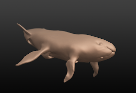 Click to enlarge; copyright Gert van Dijk
So here is a Fish, of the Fishes IV type; I showed one before. I painted four now for The Book, and will not publish these paintings here on the blog. But having done that, Fish IV anatomy came natural to me, and here it is: six flippers, usually attached higher on the body as you go aft, a large head merged without a neck to a stiff body, and three gills on each side with separate inlets but a fused outlet. You knew about the four eyes and the four jaws. As I said, typical Fish IV anatomy.
---------------------------------------------
P.S. As Luke remarked in the comments section the Fish shown so far are fairly large. Aren't there smaller ones? Yes, there are. I had realised I had a tendency towards larger ones, so I explored the possibilities of size on purpose.
Here is a rough sketch in Painter11. Its smaller size is indicated by relatively large eyes and by having thinner flippers, that as a result resemble fins more (the second pair are probably too large). I also experimented with a general 'fishy' look by giving it a glistening skin. The counter-colour pattern (dark on top, pale below) is probably a universal trick to blend into the background.
Saturday, 13 August 2011
Create your own planet (using Celestia)
The theme of this first tutorial is how to produce image of a fictional planet of your own making. Personally I use two programs to do so: Celestia and Vue. Celestia was used to produce, among others, the 'satellite images' on my site. It allows you to explore the universe, and provides detailed images of just about any object in our solar system, shown with appropriate orbits, orbital speeds, etc. The program is driven by scripts that are completely open, meaning that anyone who wants to can change almost anything. The result of this is a lively community in which you will find all kinds of real rockets and artificial satellites, but also space ships and entire solar systems from science fiction. There is a 'motherlode' and a forum.
This tutorial aims at absolute beginners as far as Celestia is concerned, but you will need some experience with a suitable graphics program. At the very least you need to be able to paint, select areas and cut and paste them. Photoshop is an obvious candidate; I have used Paint Shop Pro in the past, and now also use Painter11. I am told GIMP is also good (and free...).
The planet Mars will be given a new surface, which, in the computer world, is a 'texture'. In its simplest form that is just a colour image, but additional tricks include producing a 'bump map', allowing mountains or canyons to stick out or to be recessed, creating a more powerful 3D illusion. Another trick is adding a 'specular reflection map'. With it, areas such as seas and lakes will gleam when light falls on them, in contrast to duller areas such as land. Finally, planets can be draped in 'cloud maps', making them look like Earth.
How do you design an interesting planet surface? Or, how do you draw the surface of a 3D sphere on a flat surface? By distorting it. Severely. The image above shows a sphere with a texture of the planet Furaha, along with a cylinder on which its surface is projected. Cutting the cylinder open produces the flat map in the back. Most distortion will occur around the poles, which is very visible in the image above. The arrows all point to the same part of the same continent. On the cylinder and the flat map that area looks much broader than it is on the sphere. The simplest way not get frustrated by polar distortion is to leave the poles featureless, achieved by filling it with sea.
The map above is twice as wide as it high; those are also the proportions used by Celestia, and they make good sense. The height of the map is the distance from the South to the North Pole across the surface, or half the circumference of the planet. Walking along the equator provides the entire circumference, ending up as the width of the map. This is about the simplest map projection there is, known as a 'Plate Carrée' projection. You should use sizes that are multiples of two, because Celestia wants you to. A good size for a blank map is an image of 1024x512 pixels. If ever you are ready for more, use 2048x1024 or multiples of that.
Here is a silly map of 1024x512 pixels with a few continents on it, labeled A to E. Note that B, C and D have the same shape. Let's cover Mars with it; you can download it from the above image, or make your own version (in which case it should be 1024x512 pixels!).
You may note that there are some ridges and craters on your planet: those are the result of the bump map for Mars that is still in place. When you are ready marvelling it is time to stop gloating: the two sides do not match up. Continent A straddled the western edge of the map, and E the eastern one. Well, a map has edges, but a sphere hasn't. That simple fact tells you at the edges of the map are trouble areas. Remember that the flat map is a cylinder cut open, so the surface should be contiguous along the vertical seam. One way to do that is to use a featureless sea along the seam. But there is a better way. This boils down to cutting up the map in two halves: a western and an eastern one. Switch their positions, and the former edges now lie against one another at the centre of the image. Edit them to produce a nice continuous shape. How you cut the map into two halves depends on your graphics program. In Photoshop you can do the following (correct for CS5): Select Filter, then Other, then Offset; once there, check the box for 'wrap around' and fill in half the width of the image (which is 512) and press OK. That should do it.
Above are the results of first rearranging the squares and then editing the map. I chose to let the continents A and E fuse to form 'EA'. After you have worked on the centre of the map you can decide to revert the procedure and change the squares around again, also shown above. You can also decide not to bother, as both are equally correct.
There is a good chance that you will have noted that the continents B, C and D differed in shape on the globe, whereas they are the same on the map. The nearer the poles you get, the more pronounced the distortion is. It is extremely difficult to predict how a 2D shape will look like in 3D. The usual result is that shapes near poles tend to look pinched, i.e. many features will look like lines pointing to the pole, which is ugly and unrealistic. There are three solutions: as you may guess, the first is to fill the area with sea. The second is to muddle through: look at your latest version in Celestia and work on the flat map to correct pinching. Then save the latest effort as mars.jpg again, close Celestia, open it again as it otherwise does not refresh the map, and repeat. The third solution is the most elegant one, and requires that your graphics program can do a conversion from polar to rectangular coordinates as well as vice versa. Photoshop can do so (I learned this one from a tutorial on the Celestia forum). In Photoshop this transformation makes the rest of the map fuzzy, so it is best to use it with only part of your map:
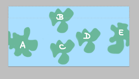 - Select the top area of your map as above: the entire width, and roughly one quarter of the height.
 - Copy this as a new image and jot down its size (for instance 1024x142, or 1024x199, etc). It should look like the one above.
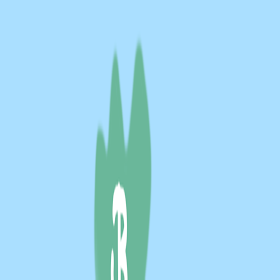 - Transform this into a square of 1024x1024 pixels ('Image', then 'Image size', uncheck 'constrain proportions', change the vertical pixel size to 1024, OK).
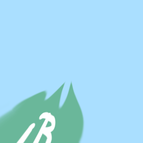
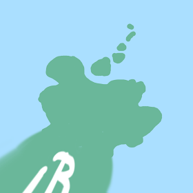 - Go to: Filter; Effects; Distort; Polar; select 'rectangular to polar' and press 'OK'. This results in a new square image as if you are looking down at the pole. That is the top one of the two above. Edit it at will, resulting in something like the one above.
- When ready, all the steps should be reversed. First revert the polar distortion: go to Filter; Effects; Distort; Polar; select 'polar to rectangular' and press 'OK'
- Give the square its original rectangular size again, which you had jotted down (use the same route: image; image size, etc.)
- Select the entire rectangle and copy it to memory
- Go back to your world map and paste the edited polar area in your map in the right area at the top.
- If need be, merge layers so you can save it again as 'mars.jpg'
The map looks rather different now, and in Celestia there is no more polar pinching! For the south pole you can rotate the world map by 180 degrees so the south comes out on top.
If you can handle seams as well as prevent 'polar pinching', you are well on your way. I may need to do another tutorial on how to design suitable colour textures, bump maps and specular reflection maps. Do not forget that there is quite a bit of material on the Celestia Motherlode, on textures as well as on many other things.
Here is a picture made with Vue of the same globe. I added a bit of 'bump mapping' and some reflectivity. There is a free version of Vue 9 that hasn't got all all options, but you can definitely make images such as this one with it. Those who wish to experiment will find it here.
I prefer Celestia for images with a realistic astronomical view. For other illustrations Vue is nice; here is a model of Furaha with a colour map, bump mapping, with a grossly exaggerated height, and different reflectivity of sea and land areas.
This tutorial aims at absolute beginners as far as Celestia is concerned, but you will need some experience with a suitable graphics program. At the very least you need to be able to paint, select areas and cut and paste them. Photoshop is an obvious candidate; I have used Paint Shop Pro in the past, and now also use Painter11. I am told GIMP is also good (and free...).
The planet Mars will be given a new surface, which, in the computer world, is a 'texture'. In its simplest form that is just a colour image, but additional tricks include producing a 'bump map', allowing mountains or canyons to stick out or to be recessed, creating a more powerful 3D illusion. Another trick is adding a 'specular reflection map'. With it, areas such as seas and lakes will gleam when light falls on them, in contrast to duller areas such as land. Finally, planets can be draped in 'cloud maps', making them look like Earth.
How do you design an interesting planet surface? Or, how do you draw the surface of a 3D sphere on a flat surface? By distorting it. Severely. The image above shows a sphere with a texture of the planet Furaha, along with a cylinder on which its surface is projected. Cutting the cylinder open produces the flat map in the back. Most distortion will occur around the poles, which is very visible in the image above. The arrows all point to the same part of the same continent. On the cylinder and the flat map that area looks much broader than it is on the sphere. The simplest way not get frustrated by polar distortion is to leave the poles featureless, achieved by filling it with sea.
The map above is twice as wide as it high; those are also the proportions used by Celestia, and they make good sense. The height of the map is the distance from the South to the North Pole across the surface, or half the circumference of the planet. Walking along the equator provides the entire circumference, ending up as the width of the map. This is about the simplest map projection there is, known as a 'Plate Carrée' projection. You should use sizes that are multiples of two, because Celestia wants you to. A good size for a blank map is an image of 1024x512 pixels. If ever you are ready for more, use 2048x1024 or multiples of that.
Here is a silly map of 1024x512 pixels with a few continents on it, labeled A to E. Note that B, C and D have the same shape. Let's cover Mars with it; you can download it from the above image, or make your own version (in which case it should be 1024x512 pixels!).
- Celestia should be on your computer. If not, download it and use it until you can at the very least find the planet Mars and get it into view.
- Close Celestia if it is open. Find the Celestia folder on your computer. Open it and locate the 'textures' folder. Within that is a 'medres' folder. It is filled with many planetary surfaces that you can study at will. Find the file 'mars.jpg' and have a look. It should be 1024x512 pixels. Save it, also in the 'medres' folder, but now as 'OLDmars.jpg' (in case you later want to replace your own planet with good old Mars).
- Now is the time to take either the silly image I provided or your own 1024x512 image. Save it in the Celestia medres folder under the name 'mars.jpg'. Don't use another size, don't use another name.
- Run Celestia and go to Mars. And there you are. Marvel and gloat.
You may note that there are some ridges and craters on your planet: those are the result of the bump map for Mars that is still in place. When you are ready marvelling it is time to stop gloating: the two sides do not match up. Continent A straddled the western edge of the map, and E the eastern one. Well, a map has edges, but a sphere hasn't. That simple fact tells you at the edges of the map are trouble areas. Remember that the flat map is a cylinder cut open, so the surface should be contiguous along the vertical seam. One way to do that is to use a featureless sea along the seam. But there is a better way. This boils down to cutting up the map in two halves: a western and an eastern one. Switch their positions, and the former edges now lie against one another at the centre of the image. Edit them to produce a nice continuous shape. How you cut the map into two halves depends on your graphics program. In Photoshop you can do the following (correct for CS5): Select Filter, then Other, then Offset; once there, check the box for 'wrap around' and fill in half the width of the image (which is 512) and press OK. That should do it.
Above are the results of first rearranging the squares and then editing the map. I chose to let the continents A and E fuse to form 'EA'. After you have worked on the centre of the map you can decide to revert the procedure and change the squares around again, also shown above. You can also decide not to bother, as both are equally correct.
There is a good chance that you will have noted that the continents B, C and D differed in shape on the globe, whereas they are the same on the map. The nearer the poles you get, the more pronounced the distortion is. It is extremely difficult to predict how a 2D shape will look like in 3D. The usual result is that shapes near poles tend to look pinched, i.e. many features will look like lines pointing to the pole, which is ugly and unrealistic. There are three solutions: as you may guess, the first is to fill the area with sea. The second is to muddle through: look at your latest version in Celestia and work on the flat map to correct pinching. Then save the latest effort as mars.jpg again, close Celestia, open it again as it otherwise does not refresh the map, and repeat. The third solution is the most elegant one, and requires that your graphics program can do a conversion from polar to rectangular coordinates as well as vice versa. Photoshop can do so (I learned this one from a tutorial on the Celestia forum). In Photoshop this transformation makes the rest of the map fuzzy, so it is best to use it with only part of your map:
 - Select the top area of your map as above: the entire width, and roughly one quarter of the height.
 - Copy this as a new image and jot down its size (for instance 1024x142, or 1024x199, etc). It should look like the one above.
 - Transform this into a square of 1024x1024 pixels ('Image', then 'Image size', uncheck 'constrain proportions', change the vertical pixel size to 1024, OK).

 - Go to: Filter; Effects; Distort; Polar; select 'rectangular to polar' and press 'OK'. This results in a new square image as if you are looking down at the pole. That is the top one of the two above. Edit it at will, resulting in something like the one above.
- When ready, all the steps should be reversed. First revert the polar distortion: go to Filter; Effects; Distort; Polar; select 'polar to rectangular' and press 'OK'
- Give the square its original rectangular size again, which you had jotted down (use the same route: image; image size, etc.)
- Select the entire rectangle and copy it to memory
- Go back to your world map and paste the edited polar area in your map in the right area at the top.
- If need be, merge layers so you can save it again as 'mars.jpg'
The map looks rather different now, and in Celestia there is no more polar pinching! For the south pole you can rotate the world map by 180 degrees so the south comes out on top.
If you can handle seams as well as prevent 'polar pinching', you are well on your way. I may need to do another tutorial on how to design suitable colour textures, bump maps and specular reflection maps. Do not forget that there is quite a bit of material on the Celestia Motherlode, on textures as well as on many other things.
Here is a picture made with Vue of the same globe. I added a bit of 'bump mapping' and some reflectivity. There is a free version of Vue 9 that hasn't got all all options, but you can definitely make images such as this one with it. Those who wish to experiment will find it here.
I prefer Celestia for images with a realistic astronomical view. For other illustrations Vue is nice; here is a model of Furaha with a colour map, bump mapping, with a grossly exaggerated height, and different reflectivity of sea and land areas.


